|
|
|
|
|
|
|
Activity Report | ~What we saw and experienced about UD~ |
To aim at the UD site
This site is a site to sell about universal design (UD). So we thought that the one that was UD was desirable for the design of the site. In addition, it is that the most familiar thing takes in a way of thinking of UD in the design of the site because we can do it as a place practicing UD. In this page, we place it according to an item how we really minded the design of the site under the thought of UD. In addition, not only a Web page, we gather it up about the method to make a report and a poster, the presentation document which a reading person is easy to read partly.
Device about the letter
Consider about Font, Size of letter, and Space between the lines
The place where we minded most in gathering up this site is a letter in the pages.
| At first, we changed the font to 「みんなの文字」. The visibility of the letter in this way increases. We can use this Web font free, so this font thinks that you should register the running a Web site. |
In addition, we increased the size of the letter than a standard and enlarged the space between the lines. The visibility of the letter increases more by doing it in this way. Because even a report and a poster, a presentation document are done not only a Web site, these laborers, please mind the readability of the letter by all means. It is the most effective method once to look back on whether it is easy to read the thing which oneself made seeing from the side of the reader.
Put hemming
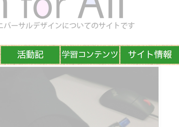
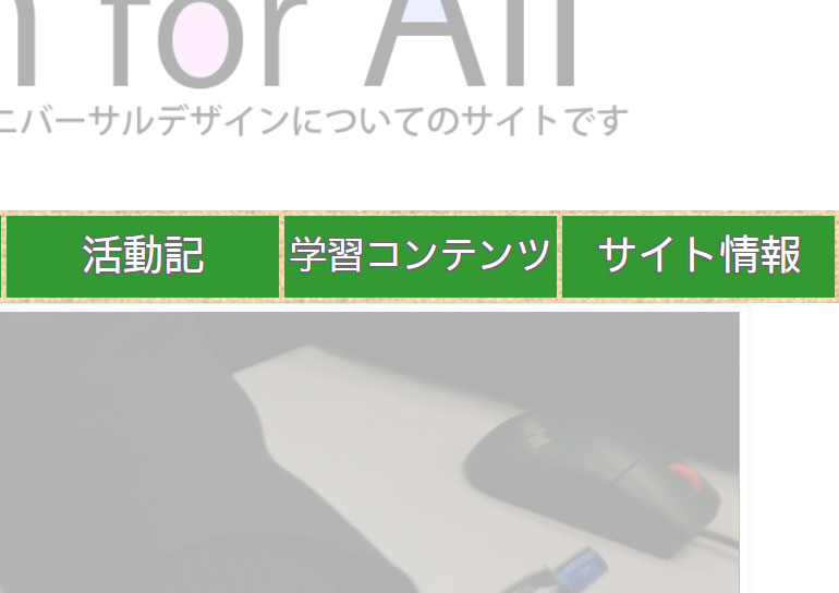
In addition to an upper device, it is easy to consider it to put hemming in a letter to put on an image and a color and is more effective. In this site, we put hemming in an upper bill of fare bar and make easy to watch it, and we put hemming in slide show of Top
Page and added it to easiness in seeing and gave a warm and amicable atmosphere.
|
|
| When there is not hemming | When there is hemming |
Correspondence to a sound reading aloud browser
Sound reading aloud browser
Sound reading aloud browser is a browser to have a function to read the sentence of a Web page made for sight people with a disability aloud mainly. It is very convenient for the person that sight is normal. They can hear a Web page by a sound while they do work such as the housework.
Recently it is shown as an extension of Google Chrome and is available easily.
To practice
But we have to devise the Web page to read the page comfortably in sound reading aloud browser. The device is make main contents by text data.
For example, we think about the case that the explanation of the Web page is imaged. To display a font that many people can't display by their device and plan the unity of the design, we display contents with an image. However, in sound reading aloud browser, it cannot read a sound aloud about the image, so it is not unfavorable using images.
We thought like that, we displayed contents by letter data as much as possible in our site. Furthermore, when we use image, we don't write the explanation inside of image but outside.
Device about the color
Consider color universal design
In this site, we considered the color of the site.
Using sense of color simulation of Photoshop, even a color-blind person inspected whether a site was readable properly mainly.
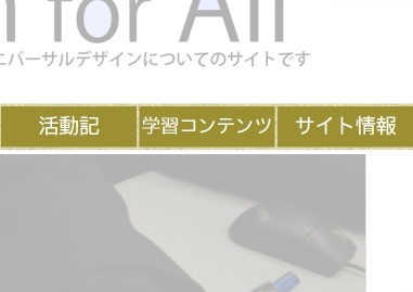
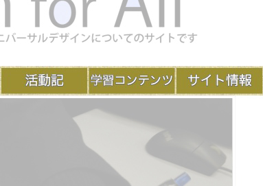
As a result of inspection, we knew that even a person with partial color blindness became easy to read the letter of the site very much by putting hemming and put hemming. In addition, we changed part of color of the site.
|
|
| When there is not hemming | When there is hemming |


