Chartjunks
Some people critize infographics that don't necessarily transmit message in a way that is easy for everyone to understand, and call these kinds of infographics "chartjunks."
Unnecessary visualization has become a problem in recent years.
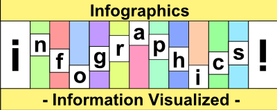
Let's look at the argument between the two people below.
For those who think the picture above is a chartjunk, easy transmission of a message is the most important element of an infographic. On the other hand, people who think the picture above is an art are generous toward what counts as an infographic.
The future of infographics will split into two directions; one towards art, and the other towards easy comprehension.
Which side are you for?


