
About MANDARA10
 MANDARA10 can visualize social issues. Why should we use it?
 We adopted MANDARA10 to introduce the usage and the formality that we cultivated in doing the exploration activity.
Five steps of map creation (1-5)
1 Create a Dataset in Excel
From the homepage of MANDARA10, a Excel template is available to be downloaded (prefectures and their population of Japan and the name of the countries and the regions of the word has been typed in advance). Type your data to make your own maps.
2 Copy dataset from Excel
Select the entire worksheet (press the Select button at the top left of the cell, or CTRL + a) and copy it.
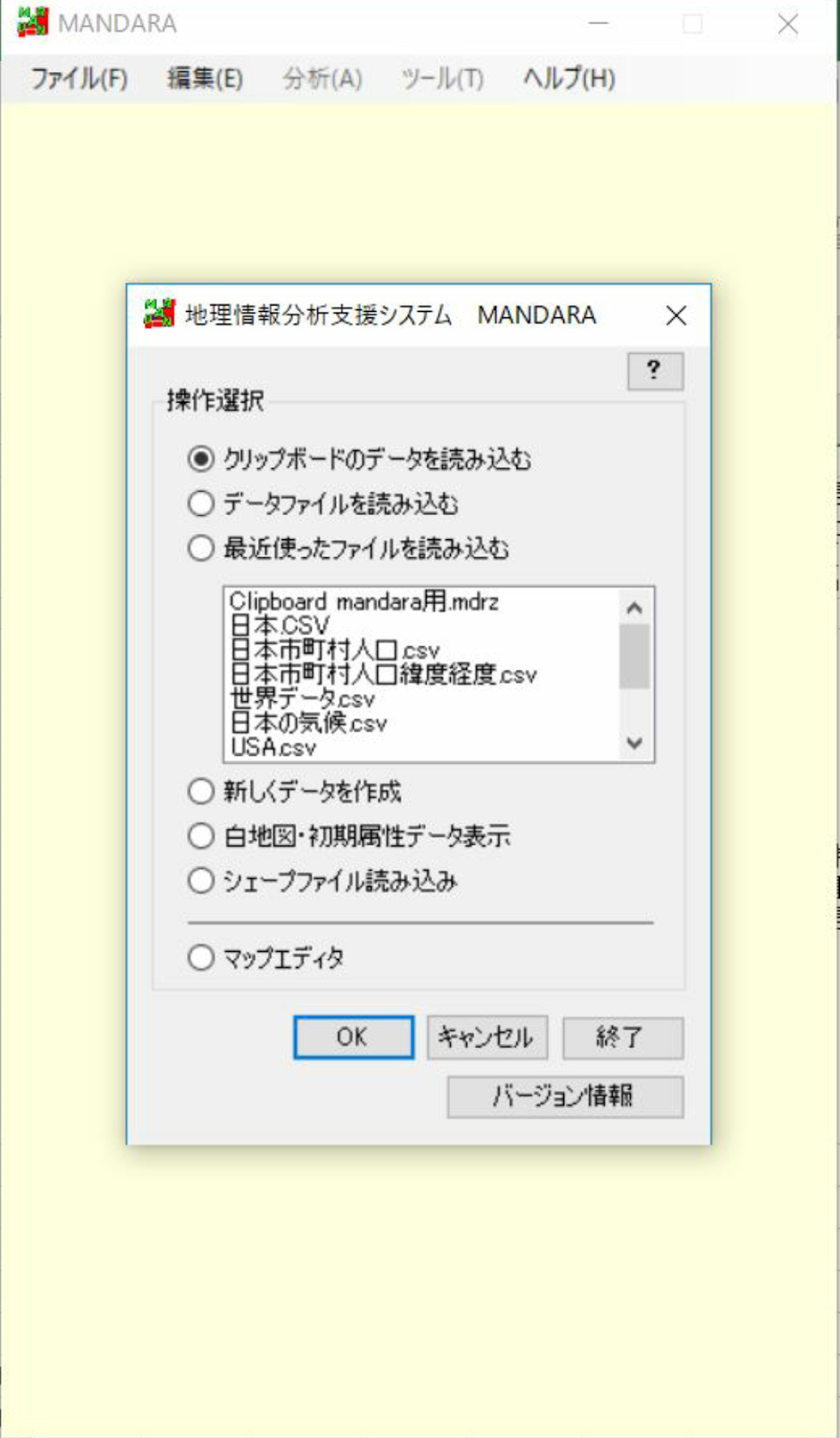
3 Import dataset
Open MANDARA10 and select paste from Clipboard.
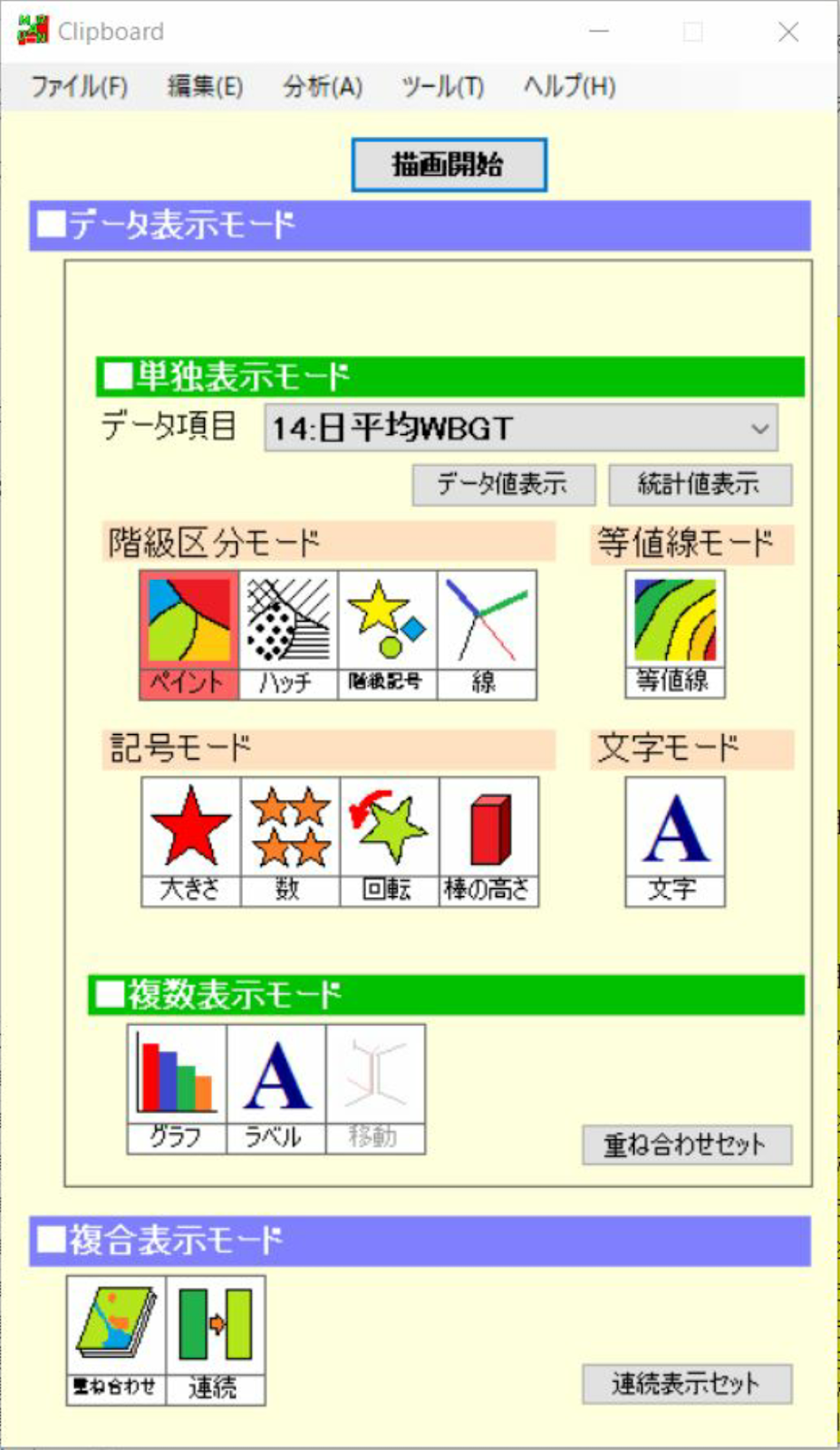
4 Choose a representation method for your map
Data display Mode > Standalone mode > data item
Select the data you want to map from the dataset in Excel. The methods which you can choose from are paint and hatch of class classification mode, and size and number of symbol modes.
Click Draw, and you can see the map.
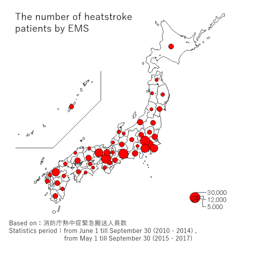
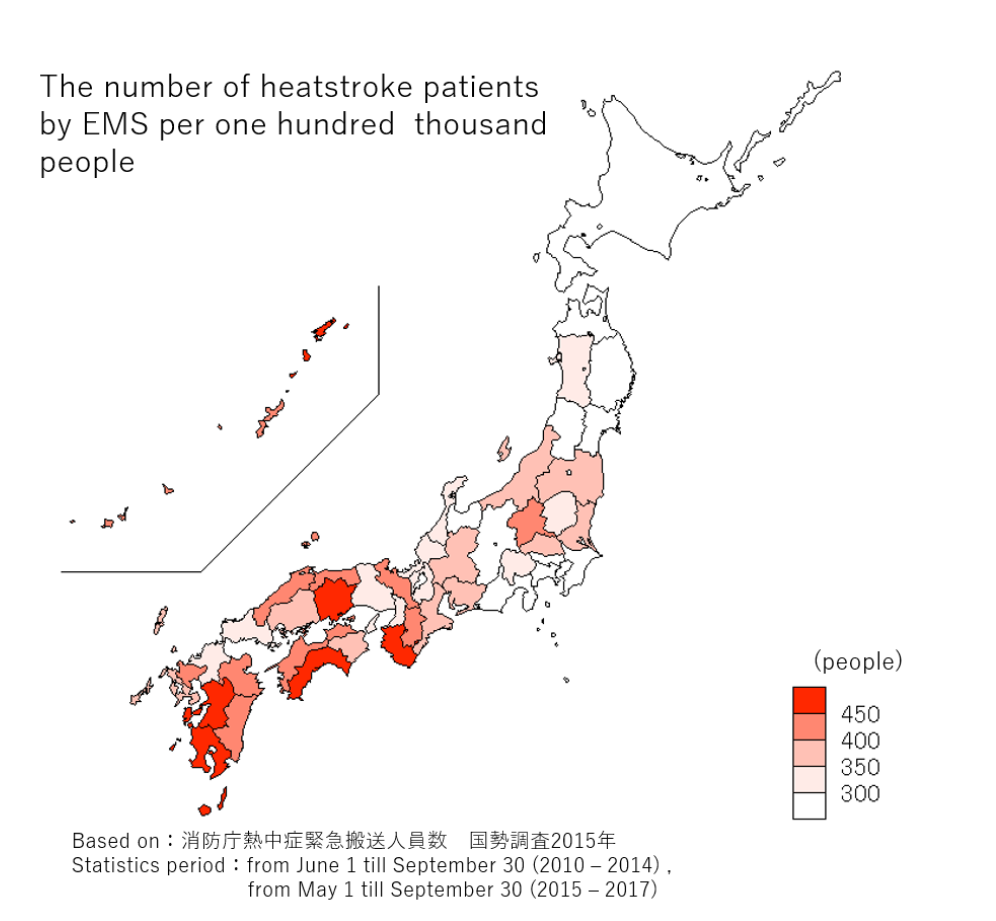
 Point: Display method
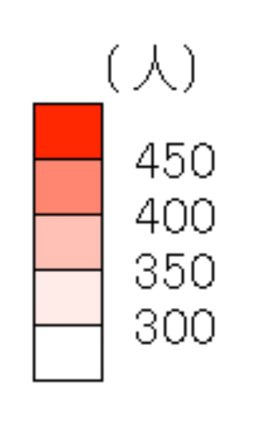
The size of the circle is used for representing the absolute number, and the change of color is used to represent the percentage. It is easy to feel confused about the following two numbers- the number of heatstroke patients by EMS and the number of heatstroke patients by EMS per 100,000 people. Therefore, we have devised a visual image to help people to distinguish the two numbers.
(For example)
Point: Color
Maps related to heatstroke patients by EMS are expressed in shades of red. Red usually present the meaning of dangerous and hot.
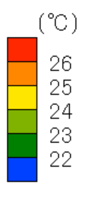
In addition, the temperature of the weather condition is expressed by color-coded based on the following image. Red represents the highest while blue represents the lowest.
(For example)
 When making a map, we make sure each element has its own meaning.

MANDARA10 can demonstrate a variety of elements at one time. You might be wondering why we did not use this function. It is because we do not want overlapping to happen. We want the visitors of our Website to see the map from anotherviewpoint . We believed that one of the solutions for heatstroke is to know and think, so we determined to create a map that can be examined from different perspectives.
5 Seeing the displayed map and adjusting the details
Set the display of text size, alignment, legend, missing values, and so on.
Point: Title
The title helps people to understand the content of the graph at a glance.
Point: World map projection
The world map uses the Eckert fourth projection. It is the equal-product projection.
options > projection transformation
You can change it there.

One advantage of using the software is of course,that you can save time. We could not have recreated the maps many times if we had drawn it manually. Once the map comes out, different from what we wanted, we recreate it again. Actually, we had to recreate it more than ten times. Because we have solid dataset in Excel, we could made the map as we had exactly expected.

If you want to know more about how to use it, click here. (PDF were created by Mrs. Numahata, our supervisor). This is a manual distributed in the global geography class for the first-year students of our school.