PRESENTATION; Our Next Frontier
slides
How to visualise ideas
Structure
 (drawn by team member) We humans acquire about 90% of all information through our eyes1. When processing the info, short and long term memories are being exchanged within our brains2. Since visual information is suitable for short-term memory, it is better to add a memorable picture for each slide rather than using bullet points. On the other hand, words are better for long-term memory, so cover that with your vocal presentation.
If you don't credit your pictures, you will be guilty of plagiarism. Though using your own pictures is a safe option, make sure to censor people's faces with an editing software to avoid privacy issues. Furthermore, place the outline/Q&A/summary/conclusion in an order so that you can see what section you will talk about next.
Role
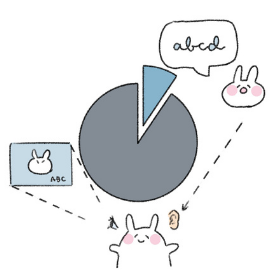
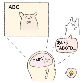
 (drawn by team member) Slides are important in a presentation because by bringing both visual and auditory senses into play, you will be able to make the audience remember the content better3. If you use too many words with bullet points, they will be focused on "reading" rather than "listening" or "seeing." However, keywords are necessary with your visual aids. Though pictures can show an abstract image of the information, what it means may vary depending on the person seeing it. By adding simple words into the picture, the message will become much clearer4. To make them easy to see, set your image to the slide background and place the key words onto there. Make sure the words don't overlap with the objects, and that the color contrast is adequate.
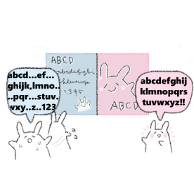
Just because something might be easy to see for you doesn't mean it is for everyone. Color blindness is not so uncommon-- 1 in 20 Japanese men have it, and 1 in 10 Japanese women carry the gene5. In the worst case scenario, the words and the background picture will appear the same color and be ineligible. To prevent that, make sure to research color blind friendly palettes or use a color contrast checker.
Standardizing
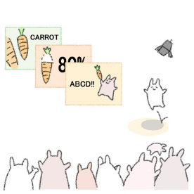 (drawn by team member) There is another element to slide creation-- "'form design"6. Simply put, it refers to fonts and palette templates that keep the slide theme consistent. Narrow down your slide image to one genre of pictures, one color palette and one font. The repetition will make your presentation more memorable, and prevent the overflow of information.
Pictures have copyrights. To make things easier, check the license type from creative commons and indicate them in your slides. It is unattractive to have the information on the picture, so compile them into one "credits" slide with the snippet of the image, the author, the license, the URL, and any other necessary info. Shorten the URL with such services to make it easier to see.
Make it simple
 (drawn by team member) This applies to animation, transition, and text. The effects in your slides are there to help the audience understand better, so unnecessary outlines, shadows, lights, and 3D effects will only overload them with information. Also, serif fonts such as Mincho have tiny decorations on the tips of the letters and are hard to see. It is better to use sans serif fonts, though you can use serif if it is necessary for the theme of your presentation.
As for the transitions, there are slide/swipe effects, right? As an example of a way to use those-- if you split the timeline across multiple slides, you can use that effect to show the flow of movement.
Final product
These are the slides for a book review presentation.
✔️ We put an image of a wall with a window since the word "window" is in the title of the book.
✔️For the slide about the author's career, we put a right to left swiping transition to show the passage of time.
✔️ We matched the image type and tried to apply the same color to all of the text.
✔️Always leave some space and don't cram list items as in references or photo credits into a single slide.
✔️Even if you are using royalty-free images, there needs to be the source and the license name.
✔️QR codes can be an alternative to shortened links for easier access to documents.