🖋Takahisa
12/17/2022

My "Recommended" features
In the past, I introduced what I consider to be the "oshi" page of the site. This time, I will introduce three of them. Here are three of them.
Here are my "Recommended" pagesHamburger Menu
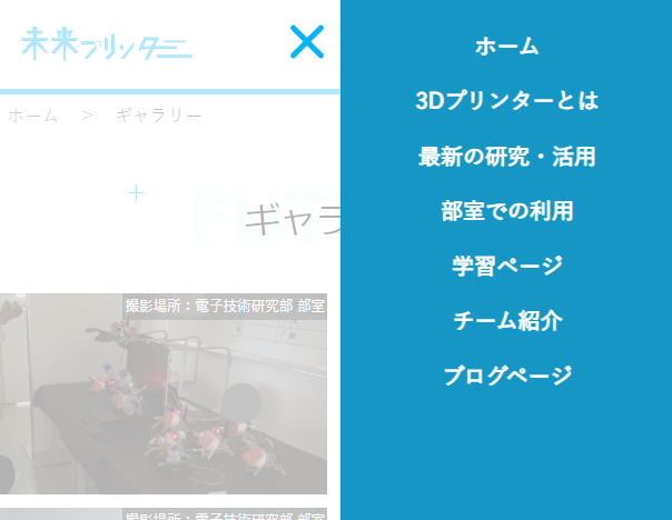
The hamburger menu is displayed in the upper right corner of the site when the size of the header is too large to display on a smartphone screen. It has a three-line shape like a congruent symbol (≡), and by pressing it to open the menu, links to various pages can be displayed. Usually, this hamburger menu is created using JavaScript, but this menu is implemented using only HTML and CSS! It is an application of HTML's checkbox functionality.
We are also very particular about the design and movement of the menu. How many hamburger menus in the world exist that, when you click on the three lines (≡), only the center line pops out, splits into two, and creates an X to close it? No, no way. (Actually, this is the kind of design I came up with when I tried to work around a difficulty in the code for moving the hamburger in CSS...) I really like this unique design feature.

Font size change
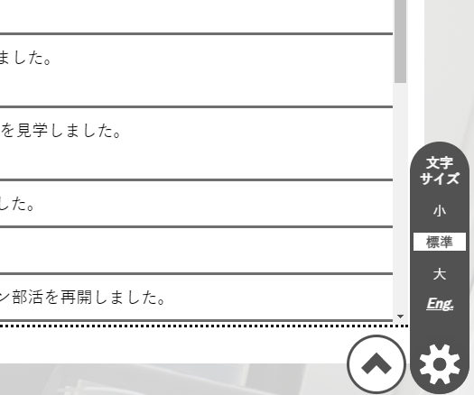
The text resize function is the first function I implemented using JavaScript. It was very difficult to specify the text to be resizable and to keep the text size information even after moving from one page to another. This is my favorite feature that I implemented so that anyone can enjoy the website comfortably.

Tag Search (Blog)
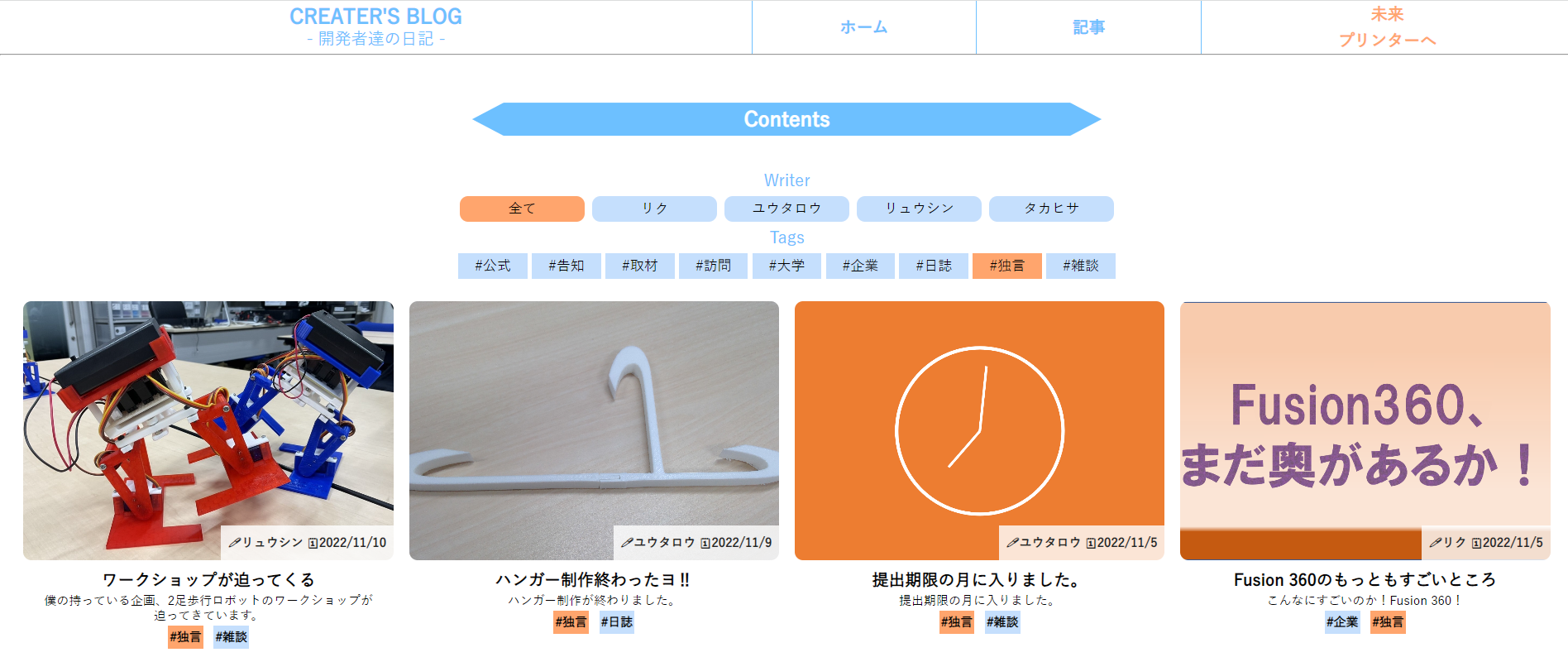
Tag search function. This is a feature within a single page of content on the blog page. By selecting a tag or a writer, only the articles that match the criteria can be displayed at once. The selected tags will have orange backgrounds, and the function is designed to be easy to use and understand.

Incidentally, this one is coded automatically by a spreadsheet software. See the following article for more details!!!
How the blog is structured: Part 1